Charts and diagrams
Charts and diagrams can help learners visualise and understand data, trends, facts and figures more easily. We can produce imaginative charts, diagrams, images and infographics to use in your slide presentations, handouts or web content.
A good example of this is the Gender pay gap report that was designed to reflect the information and statistics about gender and pay at the University.
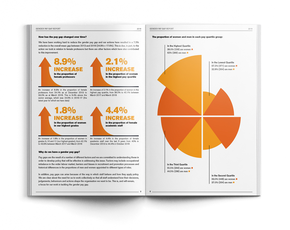
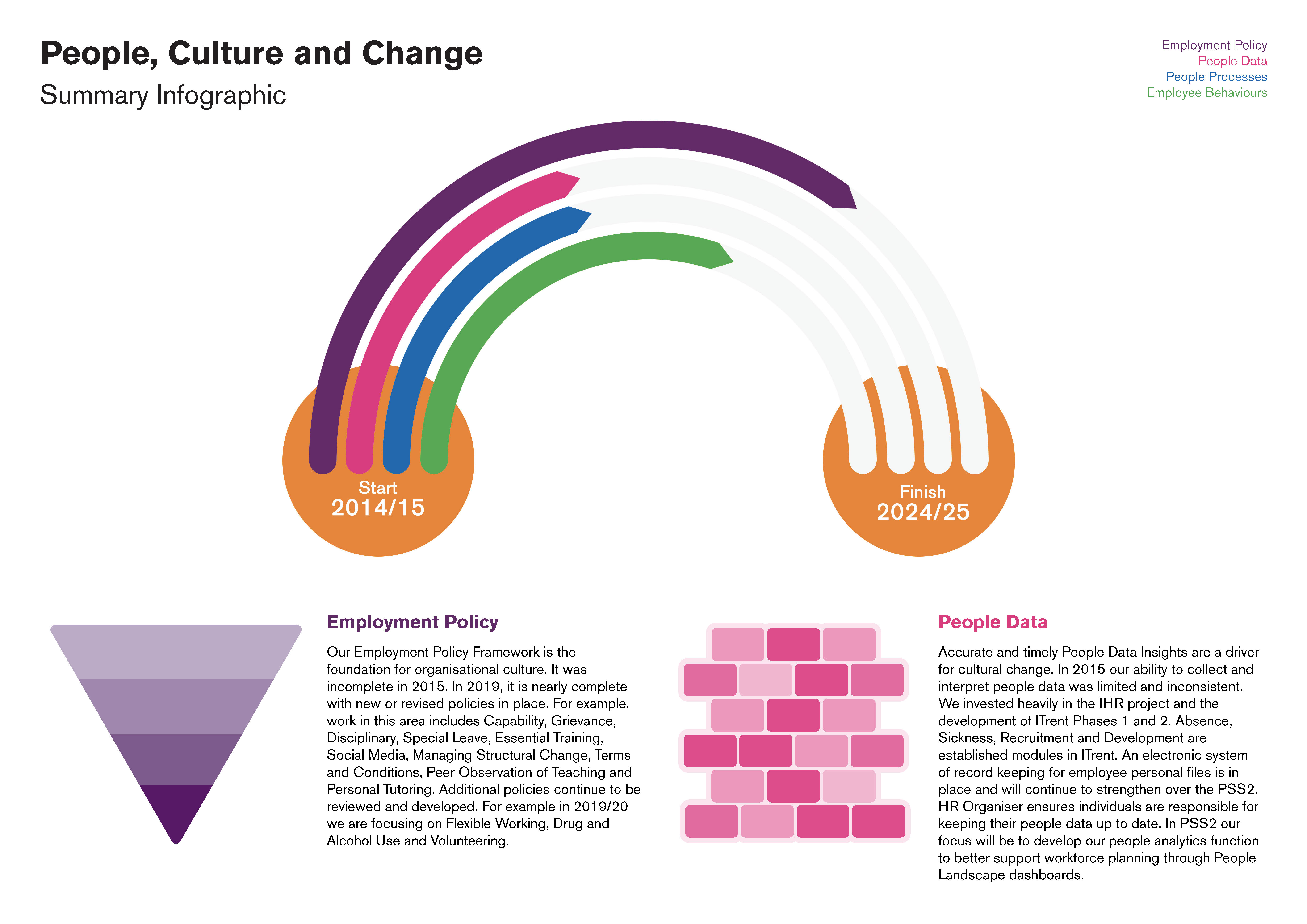
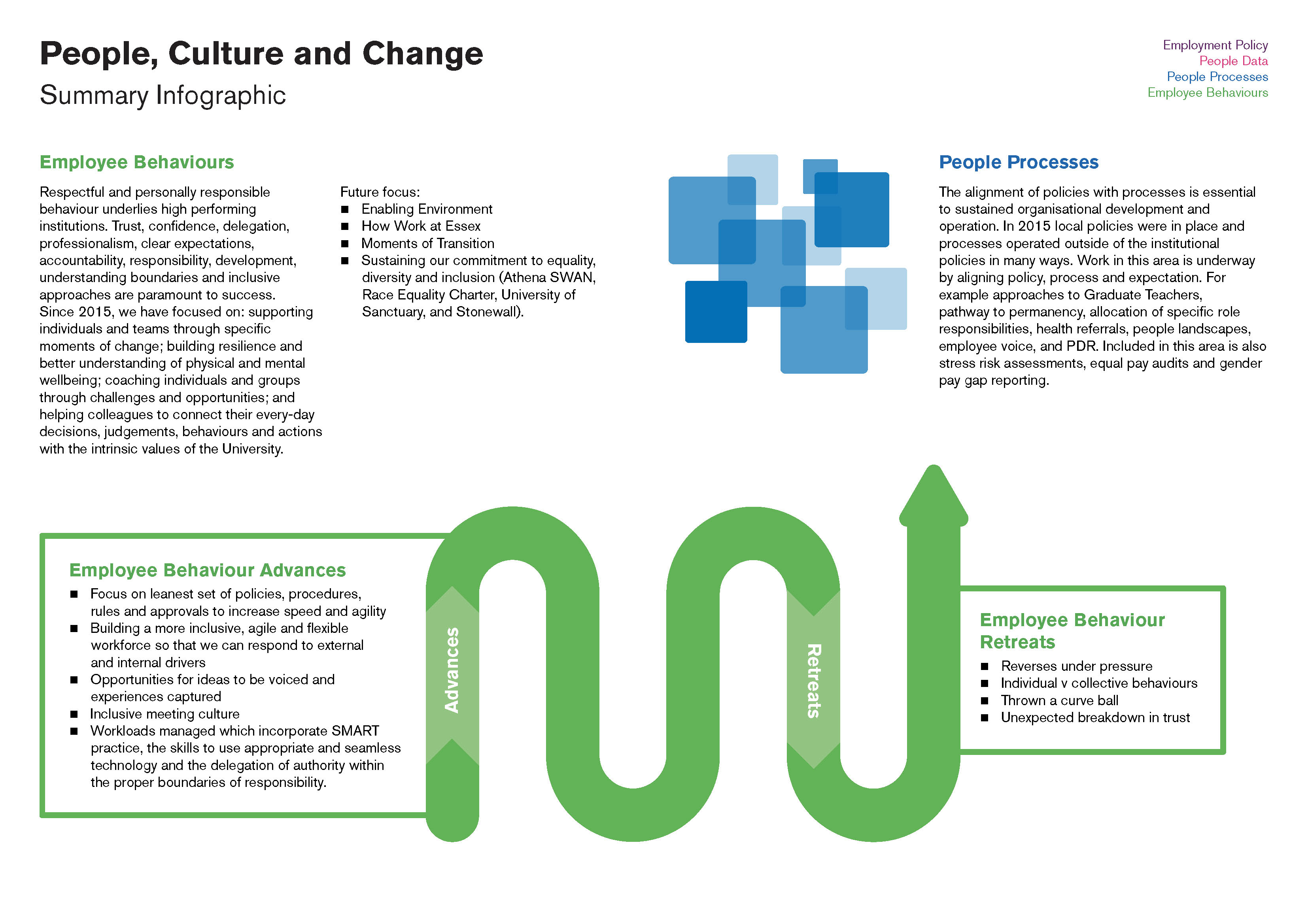
Stylish infographics were used to accompany the text and help communicate the overall message of the report. A similar approach was taken when communicating work progress around people, culture and change at Essex (see below).
We have also created a range of diagrams to be used in slide presentations. A small collection of these diagrams can be seen below.